2015 ODPC Funfest T-Shirts
Well...I'm so behind on this but I will do a separate post for the 2016 shirts.
I really wanted to do a design that would appeal to a LOT of different people, not just hammered dulcimer players. I also wanted it to convey an old-timey festival sort of vibe. The idea was for the shirt to work as both desirable merchandise AND advertising for future festivals.
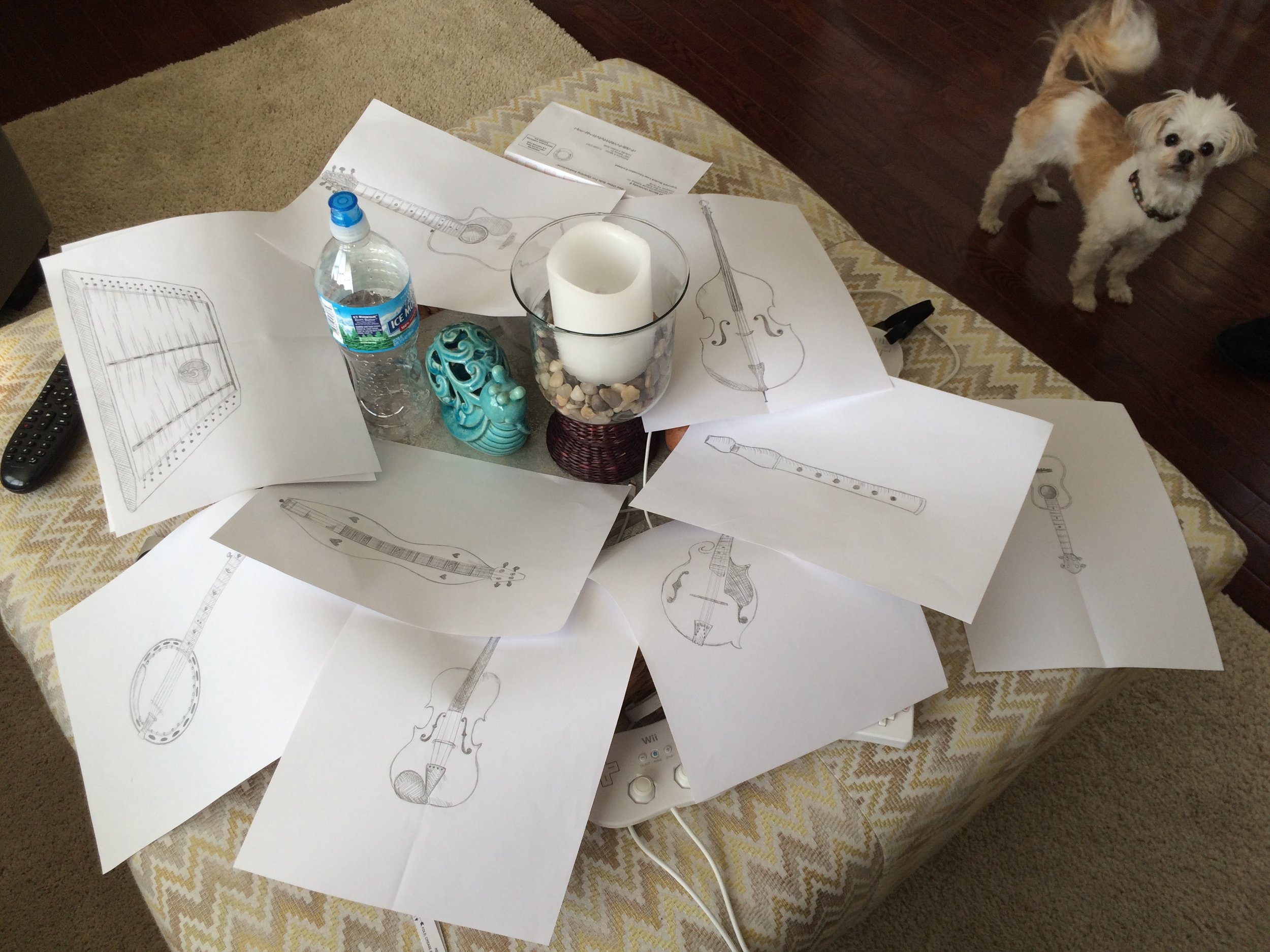
I started off with a crap ton of drawings. Once all was said and done, several people at the festival complained that I hadn't included an autoharp, or a hurdy-gurdy, or a concertina. Nothing against those instruments, but I limited myself to one P.I.T.A. instrument to draw and I had to include a hammered dulcimer, so the quota had been met before I even started. Sketching and finishing these line drawings took kind of a while.
First I scanned all of the drawings. I brought each individual element into Photoshop as black and white linework and spent some time arranging all of the pieces and masking out the instruments so that the composition was balanced. The instruments are certainly not proportionately scaled to one another, but they aren't so disproportionate that you can't tell the difference between a guitar and the 'ukulele, or the bass and the fiddle.
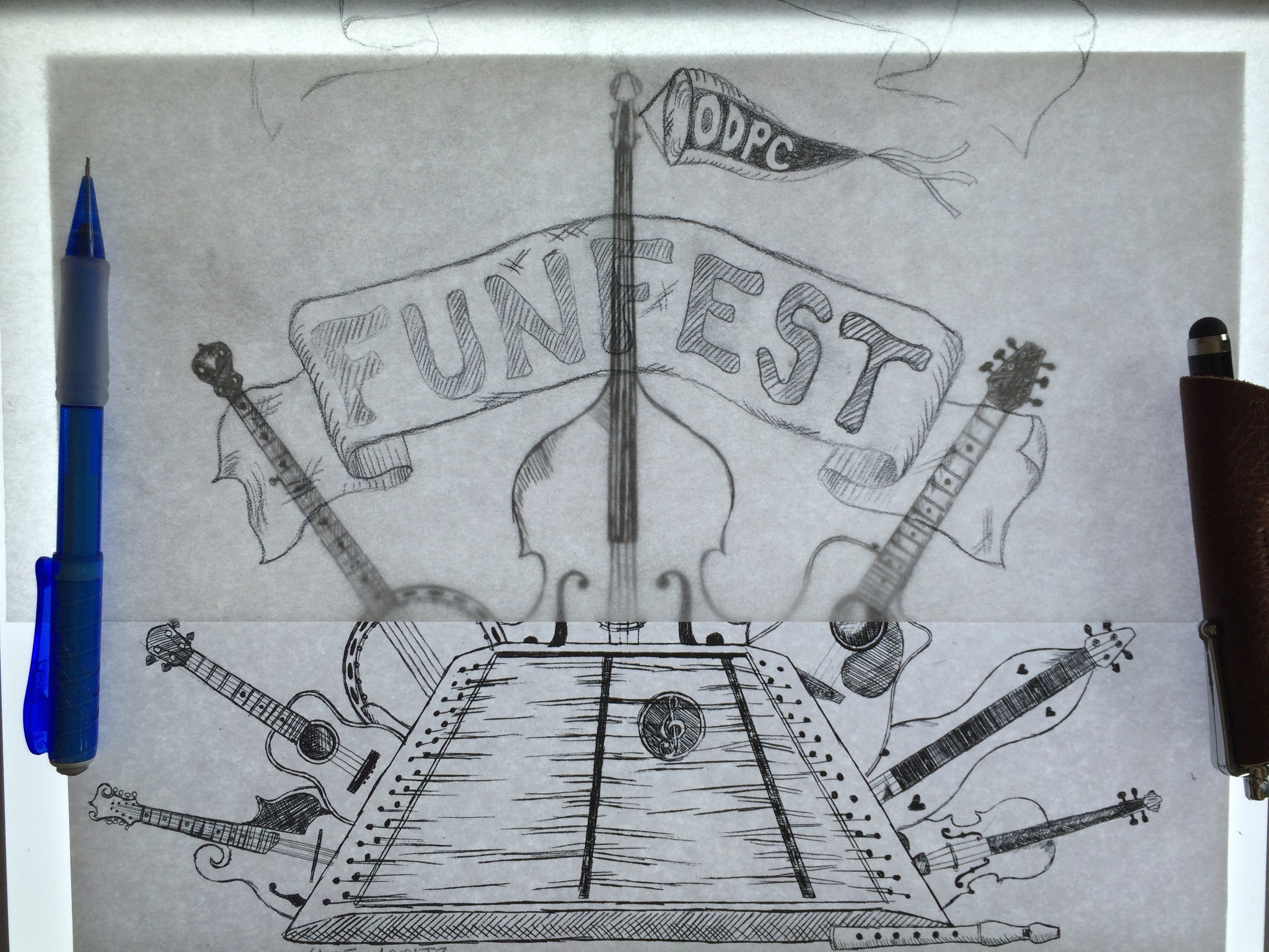
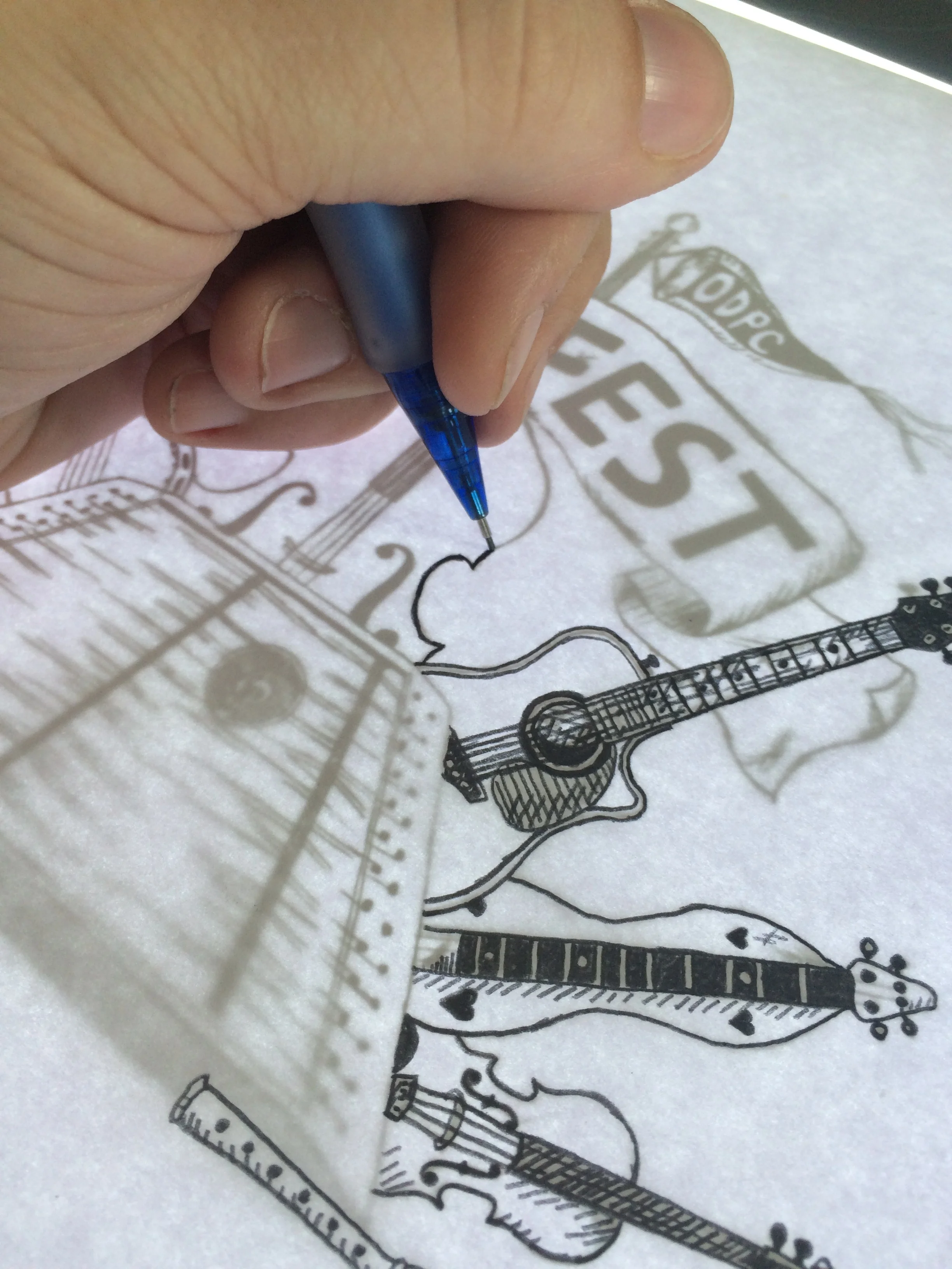
Once this was done, I printed it out and used a light table to re-draw everything so that I'd have uniform line-weights throughout the entire design. I knew I'd want this to be a two color design, so I separated the colors onto two different pieces of paper before scanning them in.
It might seem odd that these are so small, but unlike most projects, I wanted these lines to actually be thicker than I was drawing them. I always worry with screen printing that my linework will be too fine...so I figured I was better safe than sorry.
Apparently the t-shirt sales were quite a success.


